01 Research
Importing value
We started our ideation phase by deeply researching the brands of pens Penwelt would sell. It is important to understand the selling points of the products in order to better showcase them on a website.
Branding
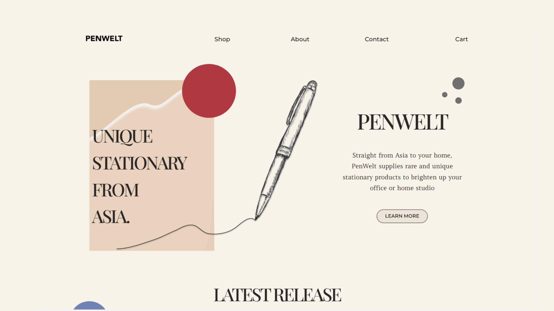
For the branding, we wanted to use elements that relate to pens and ink within a minimalistic style. We used dots and lines as the principal shapes for decoration. For the logo, we decided a logotype would evoke the typography potential of an excellent pen.

02 Planning
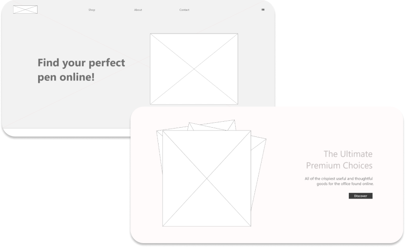
Wireframe
Once our planning and wireframing were up to our expected standard, we began with the Design. We wanted to incorporate elements of fluidity, quality, practicality, and innovation. We believe that the final design incorporates all that we strived for while maintaining the core of the brand.
03 Design
Clarity at a glance
The most important part of the design of this page, by far, was the store module itself. It needed to be clear, informative, and easy to navigate.
The basis of an effective store page is its navigation and filtration system. We spent the majority of the design time polishing this feature.
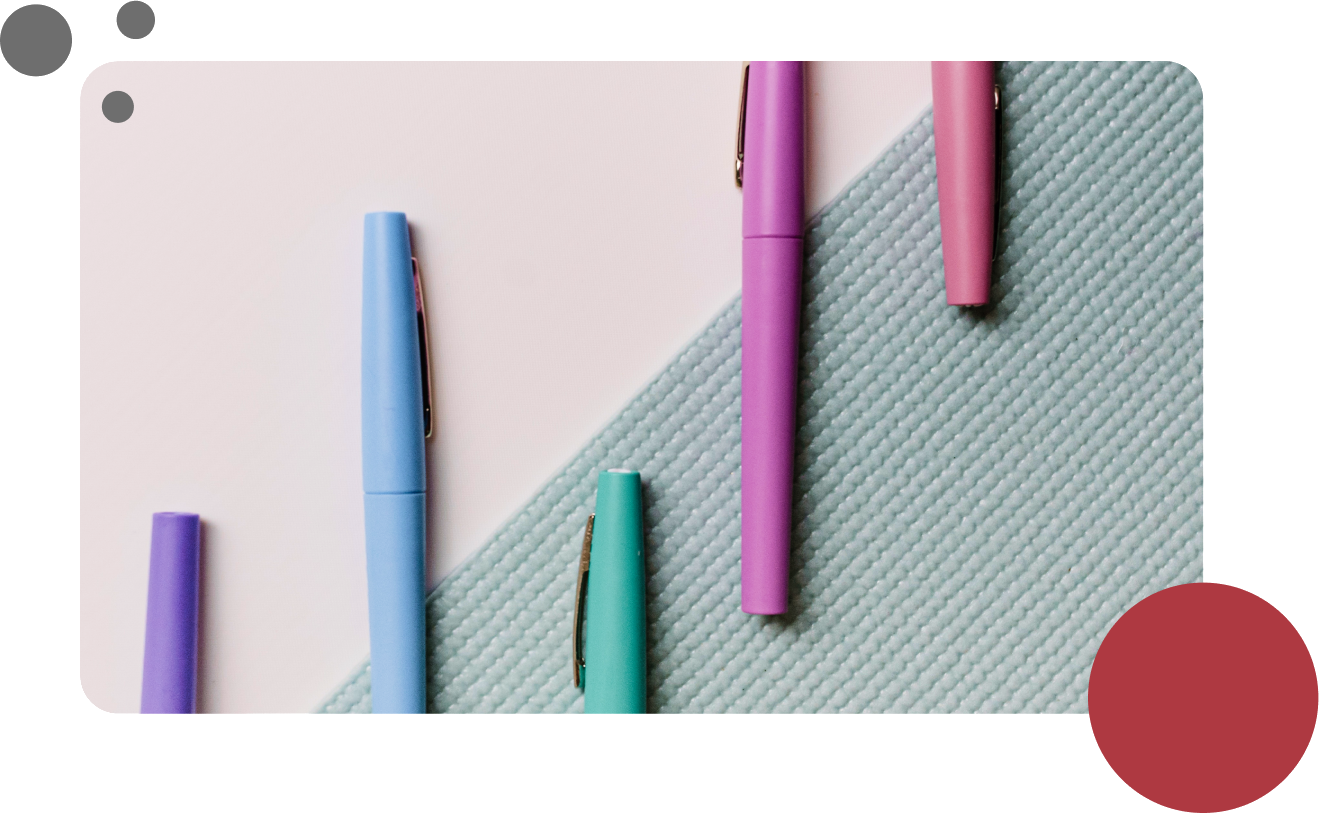
Another aspect of a good shopping experience is the inclusion of visual indicators that allow the user to preview what they get from each product. In this case, that is the type of line the pen makes as well as the colour.


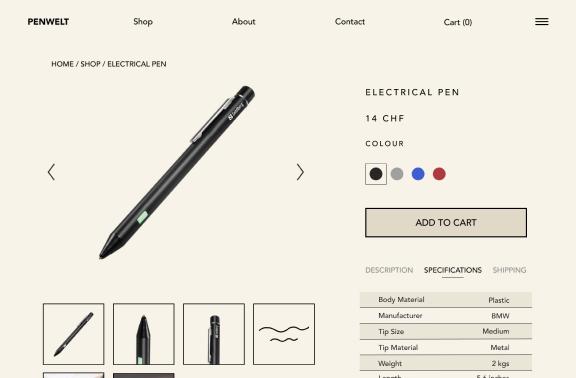
We also spent a lot of time perfecting the product page while also sticking to the conventions that have been established all over the internet. After all, it won’t matter how good the design looks if the customers see an entirely unfamiliar layout.

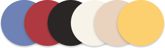
Colours
Fonts
Avenir Black
Headers
Playfair Display
Headers
Amethysta Regular
Paragraphs
Paper theme
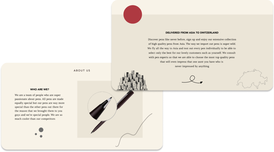
The colour scheme of the website serves to instill the feeling of paper and the look of a workspace. The fonts also evoke a sense of classic typography, or of a printing press. We wanted the website to look custom made while at the same time simple and minimalistic so that the message of a store is not lost.
We are very proud of this project and look forward to updating and promoting it going forward.