01 Research
Fulfilling a purpose
After scouring the App Store for similar apps, we found that there were very few that did what we wanted to do. And none of them did the aesthetic part justice.

Branding
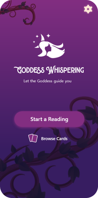
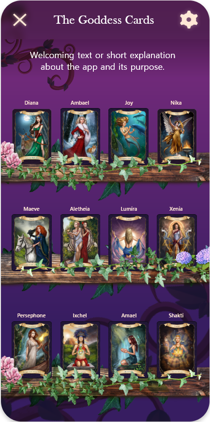
For the branding, we created a simple but distinct logo. A female silhouette with the crescent moon and stars as the backdrop, depicting or at least hinting at a Goddess. The fonts were also selected to complement the magical and divine look we wanted.
02 Planning
Wireframe
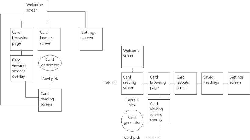
Early in the design process, we used charts to map the states we need and how all the screens are connected.
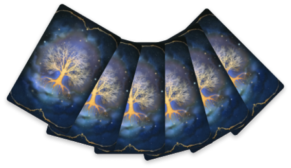
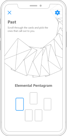
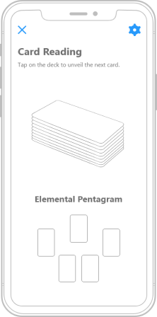
We experimented with different visual representations of the deck to determine what approach would best fit the brief.
We chose a scrollable wheel of cards. This added the interactivity needed to make the reading feel real and make the user's choice feel consequential.


03 Design
Form supporting function
The next step was creating the visual identity of the application. The tone had to match the content. Divinity, creation, the elements of nature. These were the possible avenues for exploration.
We explored earthy palettes but eventually were drawn to a darker theme with the main colour purple because it represents wisdom, magic, and mystery. And these are fitting for an app about Goddesses.
Colours

Fonts
Sherlock Vintage
Title
Baskerville Old Face
Headers
Malgun Gothic
Paragraphs
Segoe UI
UI Text
Ambiance
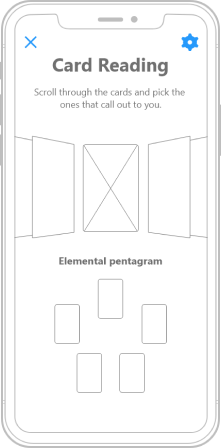
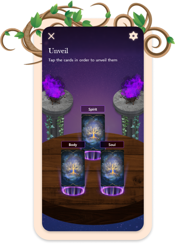
We used plant life to decorate and evoke the fertile energy of the female divine. While in the card reading interface we decided a starry background and two metallic braziers on stone pillars holding magic flames would set a powerful scene for the reading.